
This is our take on the Boho Colour Palette - it’s earthy and simple, featuring warm neutrals, a soft green and a muted pinky-terracotta.

Image Source: Benjamin Moore

Floral White OC-29
Floral White is a creamy off-white with a yellow-neutral undertone. It is the perfect white for layering in earth tones and pops of colour.

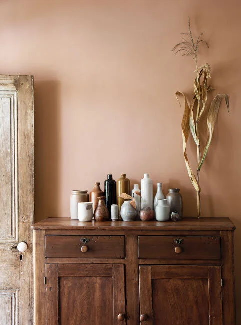
Ipanema AF-245
Ipanema is a beautiful clay-pink tone. It compliments greens perfectly but as a stand alone colour, it carries itself well. It can harmonize with many colours making it a great option to layer into an eclectic boho space.

Nature Lover CC-726
Nature lover is the perfect earthy green for a boho space! It’s soft and muted and pushing a bit towards the pastel category without being too washed out.

French Press AF-170
French press is a bold, coffee brown. It’s richness adds a beautiful punch to an earthy palette. It’s a darker option and can be used to anchor lighter and more laid back colours.